Map Dialog
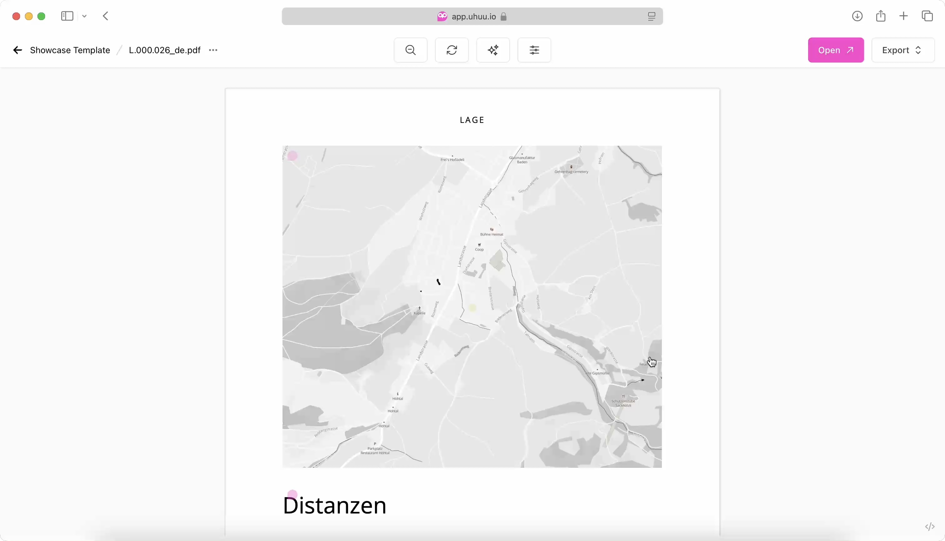
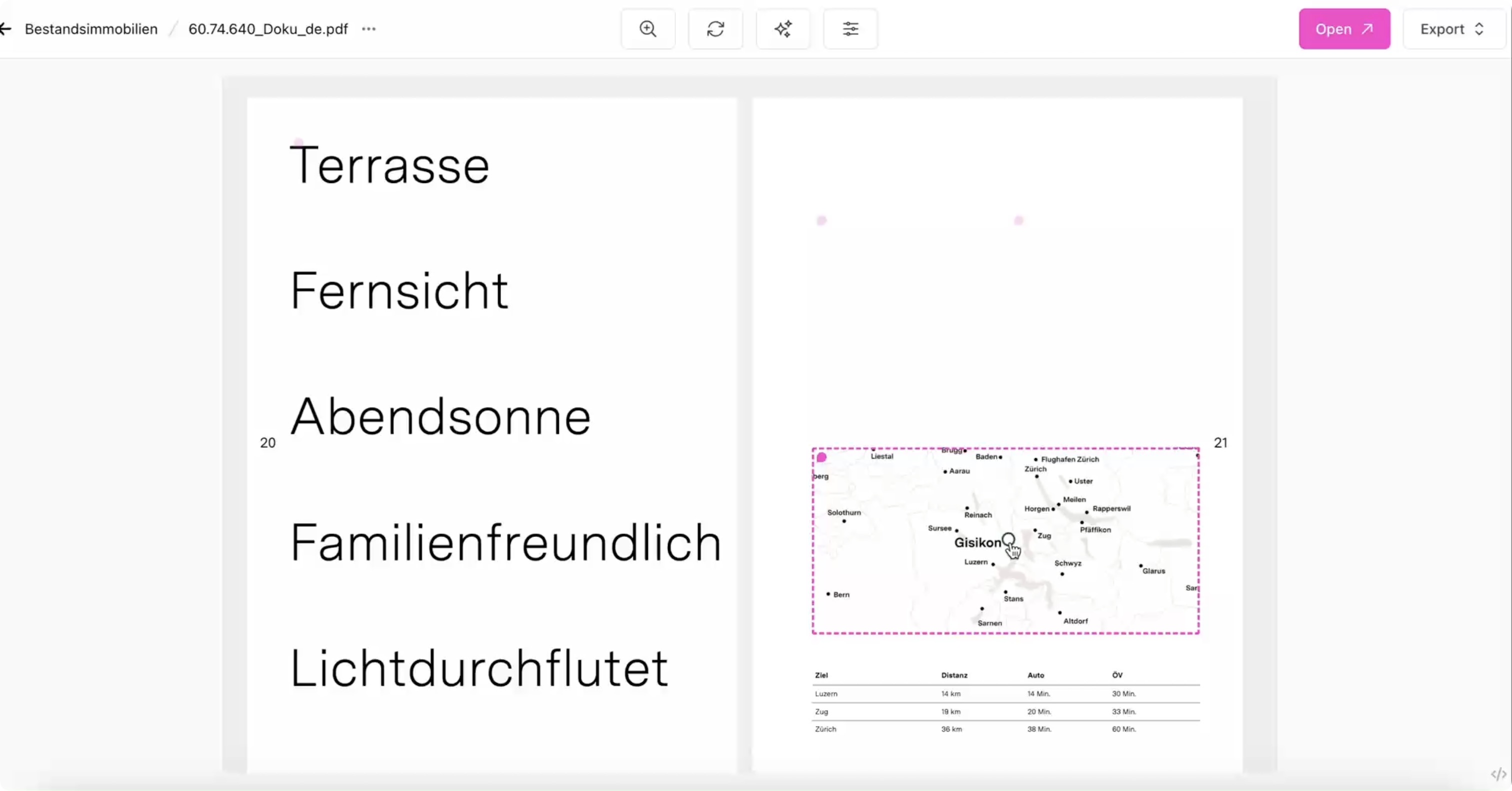
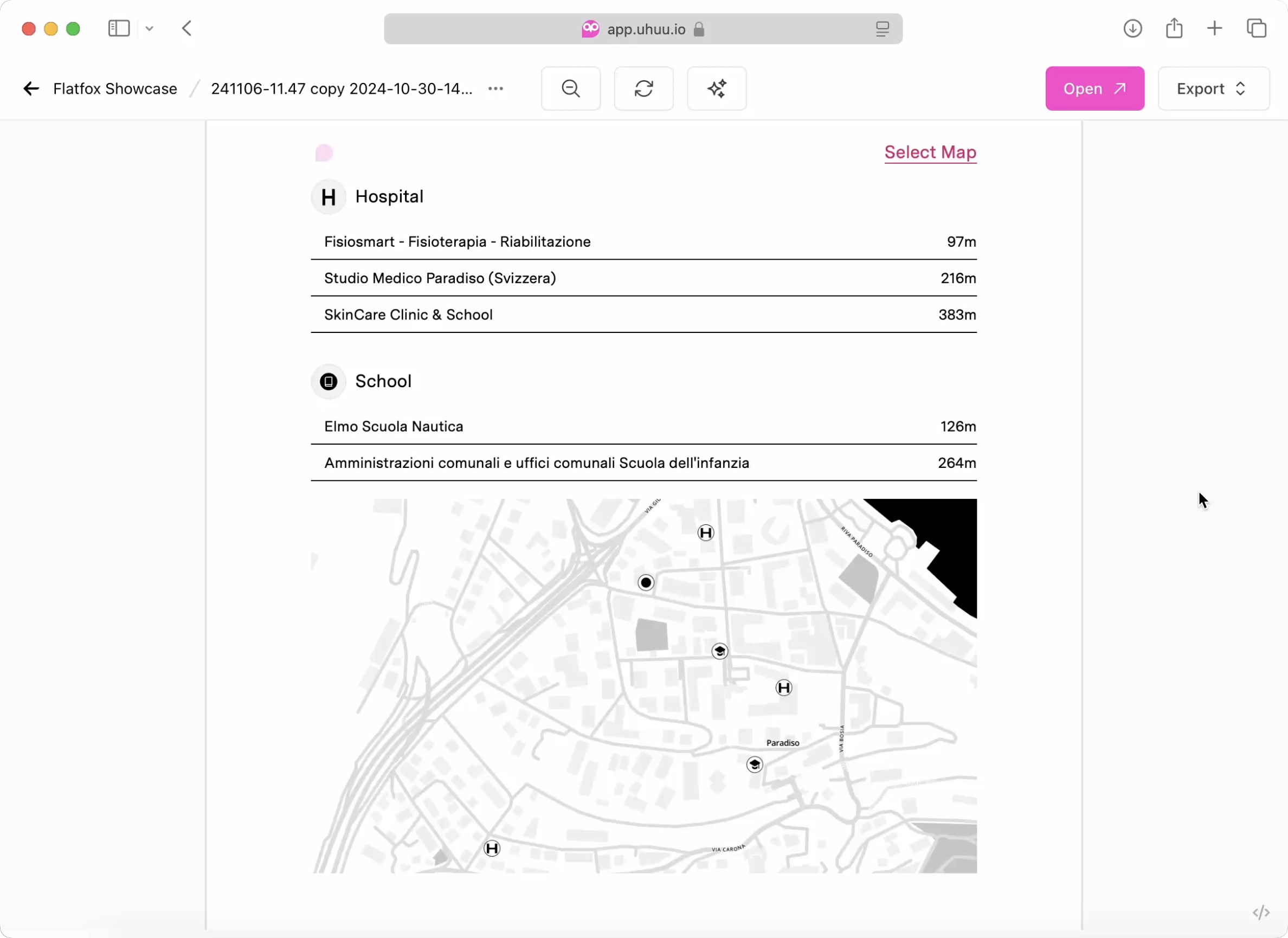
The map dialog allows users to select and display nearby places with customized icons, labels, and map styling options.

Parameters
The editDialog method is configured with the following options for map editing:
type: Set to'map', indicating that the field being edited is an map.path: Specifies the data path to store map dialog response.config: Specifies the configuration for the map within the payload.
Config
The Map Dialog configuration provides options to set the map’s center, define place types, assign custom icons and labels, and control map design options. These settings are optional, except for the lat and lng fields.
lat(float, required): Latitude coordinate for the map center.lng(float, required): Longitude coordinate for the map center.language(string, enum:"en"|"de", default:"en"): Sets the language for the dialog UI and search.types(array of strings): List of place types (e.g.,"bus_station","school") to search and display on the map.searchByType(boolean, default:true): Enables the place-type browsing UI in the left sidebar. When set tofalse, the type sidebar is hidden and only manual place search is shown as a floating search input over the map.travelTimeEnabled(boolean, default:false): Calculates Google Maps travel times for each saved place and stores all supported travel modes (driving,transit,walking,cycling) in the response payload.icons(object): Custom icon URLs for specified place types, using the type as the key and the icon URL as the value (e.g.,"school": "https://.../icon.svg").labels(object): Custom labels for specific place types, where the key is the place type, and the value is the display label (e.g.,{"golf_course": "Golf Course"}).design(boolean): Enables design mode for advanced map customization.view(string, enum: "map"|"design", default: "map"): Sets the initial view of the dialog. When set to "design", the map dialog opens directly in design mode, allowing immediate customization. If omitted or set to "map", the standard place selection view is shown first.freestyle(boolean): Allows users to apply free styling to the map.downloadable(boolean): Enables downloading the map as a static image.ratio(float, default:16/9): Defines the aspect ratio for the map image.mapWidth(integer, default:1280): Specifies the width of the map in design, measured in pixels. (value range from320to3200)iconWidth(integer, default:32): Specifies the width of icons used in design, measured in pixels. (value range from5to999)iconWidths(object): Specifies the width of each individual icon used in design, measured in pixels. (value range from5to999)styles(serray of objects): List of Mapbox styles with URLs and names, allowing customization of map appearance (e.g.,[{ url: '...', name: 'Basic Style' }]).interactive(array of strings): Defines which map interaction options are enabled for the user. Options include'bearing','pitch', and'lightPreset'.
Example Config
Example configuration below outlines the options available for setting up the Map Dialog, including place types, custom icons, map design settings, and Mapbox style integration.
const config = {
    // Required: Map center coordinates
    lat: 47.3769,
    lng: 8.5417,

    // Language setting for the UI and place search (default is 'en')
    language: 'en',

    // Array: Place types for nearby search
    types: ["bus_station", "post_office", "school"],

    // Boolean: Enable the type-based left sidebar (default is true)
    // searchByType: false,

    // Boolean: Persist travel times for saved places
    travelTimeEnabled: true,

    // Object: Custom icon URLs for place types
    icons: {
        "home": "https://platform.uhuu.io/docs/dialogs/map/icons/home.svg",
        "bus_station": "https://platform.uhuu.io/docs/dialogs/map/icons/bus_station.svg",
        "golf_course": "https://platform.uhuu.io/docs/dialogs/map/icons/golf_course.svg",
        "kindergarden": "https://platform.uhuu.io/docs/dialogs/map/icons/kindergarden.svg",
        "post_office": "https://platform.uhuu.io/docs/dialogs/map/icons/post.svg",
        "school": "https://platform.uhuu.io/docs/dialogs/map/icons/school.svg",
        "ship_station": "https://platform.uhuu.io/docs/dialogs/map/icons/ship_station.svg",
        "shopping_mall": "https://platform.uhuu.io/docs/dialogs/map/icons/shopping_mall.svg",
        "supermarket": "https://platform.uhuu.io/docs/dialogs/map/icons/shopping_mall.svg",
        "swimming_pool": "https://platform.uhuu.io/docs/dialogs/map/icons/swimming_pool.svg",
        "train_station": "https://platform.uhuu.io/docs/dialogs/map/icons/train_station.svg"
    },

    // Object: Custom labels for specific place types
    labels: {
        "golf_course": "Golf Course",
        "swimming_pool": "Swimming Pool"
    },

    // Boolean: Enables map design customization
    design: true,

    // Initial view (map or design) default is map
    // view: "map",

    // Enable interaction features like map rotation, pitch tilt, and light preset switching
    // interactive: ['bearing', 'pitch', 'lightPreset'],

    // Boolean: Allows free map styling by users
    freestyle: false,

    // Boolean: Allows the map to be downloaded as a static image
    downloadable: false,

    // Float: Aspect ratio for the map image (default is 16/9)
    ratio: 16/9,

    // Integer: Defines the width of map on design (in pixels)
    mapWidth: 1280,

    // Integer: Defines the width of icons on design (in pixels)
    iconWidth: 32,

    // Object: Defines the width of each individual icon on design (in pixels)
    iconWidths: {
        "home": 48,
        "bus_station": 32,
        "post_office": 32,
        "school": 32
    },

    // Array of objects: Mapbox style URLs and names for customizing map appearance
    styles: [
        { url: 'mapbox://styles/mapboxuhuu/cm2wkiku7003001qtbpx2dmg9', name: 'B&W Minimal' },
        { url: 'mapbox://styles/mapboxuhuu/cm2n3fjcc002h01pmbdyv84et', name: 'Blueprint' },
        { url: 'mapbox://styles/mapboxuhuu/cm2uoqo6k005r01pq7ct6f6ei', name: 'Frank' }
    ],
};
Travel Time Behavior
When travelTimeEnabled is set to true:
- The dialog uses the current map home location as the travel origin.
- By default that origin comes from
config.latandconfig.lng. - If editable home is enabled and the user changes the home location in the dialog, both distances and travel times are recalculated against the new origin.
- The response stores shared travel calculation metadata in
travelMetaand all calculated mode results intravelModes. - Templates can always pick the quickest option by finding the smallest
durationSecondsvalue intravelModes. - If travel times are not enabled, the dialog response remains unchanged and does not include travel fields.
Search UI Behavior
When searchByType is set to true or omitted:
- The left sidebar shows the manual place search input.
- Users can browse configured place types from the sidebar.
Discover with AIis available.
When searchByType is set to false:
- The left sidebar is hidden.
- Manual place search is shown as a floating overlay on top of the map.
- Type cards, type picker, and
Discover with AIare hidden. - The saved places panel on the right stays available.
Example Usage
The following react component renders a Map Dialog with the above configuration. When the “Select Map” link is clicked, the dialog opens, allowing users to view nearby places and adjust the map based on the selected configuration.
export default ({ payload }) => {
    const { map_data } = payload;
    const image = map_data?.image ?? null;
    const list = map_data?.list ?? [];
    const getBestTravel = (place) =>
        Object.values(place?.travelModes ?? {})
            .filter((travel) => Number.isFinite(travel?.durationSeconds))
            .sort((a, b) => a.durationSeconds - b.durationSeconds)[0] ?? null;
    const formatDuration = (durationSeconds) => {
        if (!Number.isFinite(durationSeconds)) return null;
        const totalMinutes = Math.max(1, Math.round(durationSeconds / 60));
        const hours = Math.floor(totalMinutes / 60);
        const minutes = totalMinutes % 60;
        return hours > 0 ? `${hours}h ${minutes}m` : `${minutes} min`;
    };

    return (
        <div>
            <div className="text-4xl pt-7 mb-14">Nearby Places</div>
            <div className="w-full" onClick={() => $uhuu.editDialog({ path: "map_data", type: "map", config })}>
                {/* Display Map Image */}
                {image && <img src={image} alt="Map" className="w-full h-auto mt-4" />}

                {/* Display List of Nearby Places */}
                <div className="flex flex-col gap-2 text-sm">
                    { list.map((place) => (
                        <div key={place.reference} className="pl-3 py-1.5 border-b border-black flex items-center justify-between">
                            <div>
                                <div>{place.name}</div>
                                <div className="text-gray-500">{place.vicinity}</div>
                            </div>
                            <div className="text-right">
                                <div className="text-gray-500">{place.distance} m</div>
                                {getBestTravel(place) && (
                                    <div className="text-xs text-gray-500">
                                        best: {formatDuration(getBestTravel(place).durationSeconds)}
                                    </div>
                                )}
                            </div>
                        </div>
                    ))}
                </div>
            </div>
        </div>
    );
};
Response Fields
list: An array of nearby places selected in the Map Dialog. Each place object contains:reference: A unique identifier for the place.name: The name of the place (e.g., "Zurich HB").vicinity: Address or general location description.latandlng: Latitude and longitude coordinates of the place.type: Type of the place, such astrain_stationortown_square.distance: Distance from the map center to the location, in meters.travelMeta: Shared metadata for the travel calculation. Present only whentravelTimeEnabledis enabled.origin: The origin coordinates used for all calculated travel modes for that place.calculatedAt: ISO timestamp for when the travel calculation batch was created.
travelModes: A map of calculated travel results by mode. Present only whentravelTimeEnabledis enabled.driving,transit,walking,cycling: Travel result for each mode.durationSeconds: Duration in seconds.distanceMeters: Distance in meters.
Travel values are intentionally stored as numeric fields so templates can format them however they need.
image: A URL to the generated map image that visualizes the selected places on a map. This image can be directly embedded within the template to provide a visual representation of the nearby locations.
Example Response
After users interact with map dialog, the response data is structured as following:
{
    "list": [
        {
            "reference": "ChIJQW4OzAgKkEcRp1KMX7aYxvU",
            "name": "Zurich HB",
            "vicinity": "Bahnhofplatz, 8001 Zürich, Svizzera",
            "lat": 47.3781458,
            "lng": 8.540251699999999,
            "type": "train_station",
            "distance": 176,
            "travelMeta": {
                "calculatedAt": "2026-04-01T10:08:47.301Z",
                "origin": {
                    "lat": 47.3769,
                    "lng": 8.5417
                }
            },
            "travelModes": {
                "driving": {
                    "durationSeconds": 420,
                    "distanceMeters": 2100
                },
                "transit": {
                    "durationSeconds": 300,
                    "distanceMeters": 1400
                },
                "walking": {
                    "durationSeconds": 720,
                    "distanceMeters": 900
                },
                "cycling": {
                    "durationSeconds": 240,
                    "distanceMeters": 1000
                }
            }
        },
        {
            "reference": "ChIJAzjwR6ugmkcRp5p8Ovu2-rM",
            "name": "Bellevueplatz",
            "vicinity": "Bellevueplatz, 8001 Zürich, Svizzera",
            "lat": 47.3671349,
            "lng": 8.5449292,
            "type": "town_square",
            "distance": 1113
        }
    ],
    "image": "https://example.com/path-to-generated-map-image.jpg"
}
Usage Summary
- Map Dialog provides an interactive way to add location data and a custom map to documents.
- Location List: Allows users to review and display selected places with relevant details.
- Travel Times: When
travelTimeEnabledis enabled, each saved place includes a sharedtravelMetaobject plus atravelModesobject with all calculated modes. - Map Image: Embeds a generated map image that visually represents the selected locations.
Style with Mapbox Studio
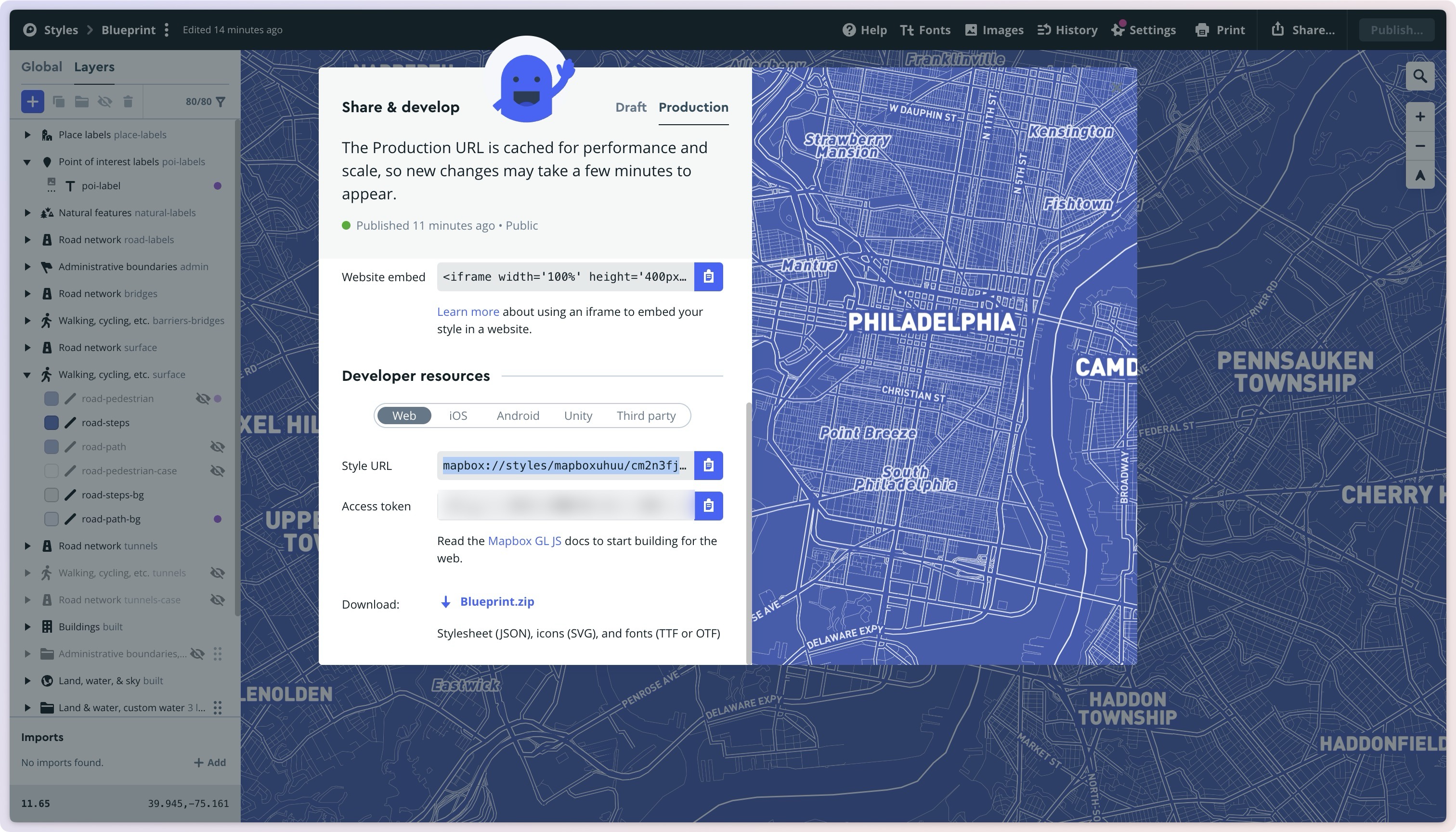
- Navigate to Mapbox Studio. Create a new map style or open an existing one.
- In the style editor, click on the “Share” button (or “Publish” if it’s unpublished). A modal will appear with the style URL.
- Copy the
mapbox://styles/...URL and use it in your Mapbox project to apply the custom style to your map.

That’s it! Now you can style your maps with your chosen design.
Sample Mapbox Style URL:
mapbox://styles/mapboxuhuu/cm2n3fjcc002h01pmbdyv84etYou can quickly preview styles using: Dialog Map Style Preview
Place Types and Customizing Icons
You can specify place types for searches, which are supported in Place Details results and as part of autocomplete place predictions. When making a Place Details request, include the desired types in the types field. For autocomplete, check the Places Autocomplete documentation for guidance on using these values.
To customize icons for specific place types, use the exact keys from the Place Types API. For example, to change the default icon for a spa, set the key to spa in your configuration. This ensures accurate mapping and display of custom icons for each place type.
Additional Place Types
As part of the result of a Place search request those type of place results may return.
The types below are not supported in the type filter of a place search.
Multiple Types
When you have multiple dialog types available in an editable area, or you want to provide multiple dialog types for the same field, you can use the types parameter to pass an array of dialog options. This lets users choose the preferred way for editing the payload.

In the example below, we have two dialog types available for the same field. The first one is an image dialog type. The second one is a map dialog type.
$uhuu.editDialog({types: [
    { path: 'uhuu_restore.my_data', type: 'image', ratio: 1 },
    { path: 'uhuu_restore.my_data', type: 'map', config: { ...baseMapConfig, lat, lng, ratio: 1 } },
  ]});
FAQ
Q: How can I make my icons available as links for use in the code?
(e.g., https://platform.uhuu.io/docs/dialogs/map/icons/home.svg)
You can upload SVG icons to any accessible server, such as S3, Google Drive, or an FTP server, and load them from there.
Q: How does backward compatibility work when adding map-generated images?
The map dialog will set the generated map image and list values to dialog's path. Before users interact with the map dialog, this value will be empty.
For backward compatibility, you can implement a fallback mechanism to check empty path value and handle accordingly.
Here’s an example of how to handle this:
export default ({ payload }) => {
    const { map_data, fallbackImage } = payload;
    const image = map_data?.image || fallbackImage;

    return (
        <div className="w-full" onClick={() => $uhuu.editDialog({ path: "map_data", type: "map", config })}>
            {image && <img src={image} alt="Map" />}
        </div>
    );
};
In this example:
- If
map_data?.imageexists, it will be used. - If not, the
fallbackImagewill be used instead, ensuring the application functions smoothly with older templates.
Q: Should I initialize the first value in the template setup?
No, initializing the first value (e.g., map_path) in the payload is not necessary unless you need default values.
If default values are not required, you can omit them in the template setup. Uhuu dialogs will automatically set the necessary values when users interact with the dialog.
Are you using with uhuu_restore?
This also applies to the reserved variable uhuu_restore, which is used for maintaining the state. For example, you can define the path uhuu_restore.map_path without initializing it in the template setup and values will be set when users interact with the dialog.
export default ({ payload }) => {
    const { uhuu_restore } = payload;
    const image = uhuu_restore?.map_data?.image || null;

    return (
        <div className="w-full" onClick={() => $uhuu.editDialog({ path: "uhuu_restore.map_data", type: "map", config })}>
            {image && <img src={image} alt="Map" />}
        </div>
    );
};
uhuu_restorereserved key storage helps you keep the assigned values even after fresh data is fetched from integration.
Q: Why aren’t all types defined in the code shown in the selector?
(e.g., ship_station, kindergarten, or golf_course)
Only Google Place Types are displayed in the place type selector. These are the standard types supported by the Google Places API for querying and fetching nearby locations.
For custom types like ship_station, kindergarten, or golf_course, you can add them manually. First, use the place search to select a location, then change the type to your custom value afterwards.
Here’s a video demonstrating how to add and customize place types:
